

E-Commerce VS Retail Packaging Design Considerations
Why one size doesn’t fit all
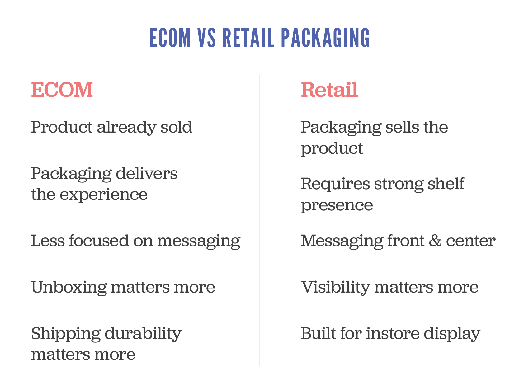
Here’s something many business owners find out the hard way. Designing for e-commerce and designing for the retail shelf space require quite different approaches.
These two channels are completely different environments. Your packaging isn’t just there to look good, it has a job to do, and that job changes depending on where your product ends up. Graphic Design doesn’t exist just to make things look pretty, it requires design strategy implementation to be truly effective.
Let’s break down the key differences so you can ensure you plan accordingly and avoid costly mistakes from day one.
Firstly, your first impression works a bit differently
In-store
Your packaging is the first impression. It’s up against a sea of competitors, fighting for attention in seconds. If it doesn’t grab someone quickly, kiss goodbye to the sale, my friends.
E-commerce: The sale has already happened. Your packaging arrives after the click, making it less about persuading and more about that impression at the door. This is your chance to reinforce your brand and create a memorable unboxing moment. You’ve seen the videos on social of people raving about their purchases, take notes my friend.
The differences
In-store needs to attract attention. E-commerce needs to deliver an experience.
Secondly, your hierarchy of information needs to shift
Retail shelf packaging needs to communicate fast and clearly a number of things:
What is the product?
Who is it for?
Why should I give a shit?
What the key features of benefits are?
For online stores, the heavy lifting has already been done by your website or marketplace listing. Your packaging can afford to strip back the sell and lean into storytelling, tone of voice, and visual impact.
Avoid the common mistake of trying to cram all your retail messaging into an e-comm pack.
You’ll end up with clutter that confuses instead of converting. Consumers are lazy beings; treat them accordingly and make it simple AF.
Retail is about standing out visually, e-commerce is about pinpoint presentation
On shelf, your packaging may be stacked, lying flat, or only partially visible. It has to work from multiple angles and grab attention fast. This is where smart use of colour, layout and shape makes a real difference.
Online, you control the product photo, but your customer still interacts with the physical pack when it arrives at their door. Think about how it opens, whether it feels premium (if the price point is high on the item), and whether the structure helps protect and present the product well.
Design for the journey, not just the destination
Retail packs sit on shelves, possibly handled by a few customers. They need to be tidy and tamper-proof, but not bulletproof.
E-commerce packs go through warehouses, vans, sorting depots, and who knows what before reaching the buyer. If your packaging can’t take a few knocks, you’ll end up with broken products, refund requests, and bad reviews.
Spend the money where it matters
Retail packaging often benefits from premium finishes like foil, embossing or spot UV. I’ve made myself hoarse saying this but it really is your silent salesperson, and it needs to impress. If you disagree with that statement, then you haven’t unlocked the potential there is for your product when your packaging is designed rooted in a strategic approach. No design is done on a whim; if your designer can’t justify the ‘why’ in what they’ve presented to you, they’re not the right person to move the needle for your business.
E-commerce packaging might not need all the bells and whistles especially if the customer bins it minutes after opening. A well-designed insert, printed tissue paper, or branded seal can have more emotional impact than a fancy box.
Be strategic, not just stylish.
So what should startups do?
Start by asking this very simple question
Where is my customer encountering my product first?
If you’re selling online only, focus on the unboxing experience and protective design.
If you’re going into retail, create shelf-ready packaging with a strong disruptive visuals and clear messaging
If you’re doing both, be prepared to develop two packaging solutions, or work with a designer who can build in smart flexibility.
I’ll leave you with some parting thoughts. Good packaging isn’t just pretty. It’s a key part of your customer experience and your product’s performance.
Design for the sales channel, not just the product. Understand the difference between selling on shelf and selling at the doorstep, and design accordingly.
As a specialist packaging design agency we can help if you’re unsure on how to move forward with the decisions around your packaging. Just sing out!
Download our Packaging Guide
If you’re looking to organise packaging for your product, grab our packaging guide for tips and tricks and a handy checklist to ensure you don’t overlook anything and avoid costly mistakes and delays
Stop Burying the Good Stuff on Your Packaging
We’ve all seen them, those bold promises, the eco-friendly stamps, the endless buzzwords. Brands love them. But here’s the brutal (and honest truth) most brands are getting it wrong.
Having the right claims on your packaging is important. But having them in the right order? That’s where the real nugget of gold is.
The problem with overloading the pack
Brands often treat packaging like a billboard for every single thing they want you to know. The result? Customers are hit with a wall of text and logos, left squinting at the shelf trying to work out what the hell you are trying to tell them. Spoiler: many just won’t bother.
If you’re leading with certifications, niche ingredients, or a long-winded brand story then key elements like taste, health benefits, or convenience are buried under your layers of marketing waffle – you’re losing sales. It’s as simple as that.
Claims matter BUT accuracy matters more
Let’s get one thing straight: every claim you make needs to be accurate. This isn’t just about avoiding legal issues (although, that’s obviously pretty bloody important). Consumers are more switched on. If they sense you’re bending the truth or bullshitting them on what your product delivers, the trust is gone – and once it’s gone, it’s near impossible to get back (sounds a bit like a relationship a bit eh, because it is!).
Misleading claims might gain attention short-term, but they will damage your brand long-term.
Regulations aside, customers talk. If what’s on the pack doesn’t match what’s inside, social media will hear about it and I dare say not ALL publicity is good publicity, depends on who you ask I guess.
Which claims actually matter to consumers?
The big question: what do people actually care about when they’re standing in front of your product? It depends on your audience, but here are some that often carry the most weight:
Taste
Let’s not overcomplicate it – people buy food because they want it to taste good. If you’re leading with every ethical certification under the sun but they’ve no clue if it’s actually enjoyable, you’ve missed the mark.
Benefits
We’re all a bit more health-conscious these days. Whether it’s high protein, low sugar, or packed with vitamins – if it’s genuinely better for them, shout about it (metaphorically speaking)
Convenience
Quick, easy, on-the-go? Busy shoppers love it. If your product fits into their hectic day, make that crystal clear.
Sustainability
Consumers do care about the planet – but it’s got to feel authentic, we’ve all had enough of Greenwashing BS. Saying you’re 'eco-friendly' without any proof? That won’t fly. Be specific – recyclable packaging, carbon neutral, or sustainably sourced ingredients. Real, clear actions.
Free-From Claims
Dairy-free, gluten-free, vegan – these can be make-or-break for certain shoppers. But don’t let it overshadow the basics like taste and quality.
Getting your claim hierarchy right
Knowing your audience is everything. What do they value most? Start there.
Your claims should follow their priorities – not yours.
Think of your packaging like a conversation:
What’s the first thing they need to know? (Taste, benefit, or convenience)
What’s the reassurance they’re looking for? (Sustainability, quality, free-from)
What’s the extra detail if they want to know more? (Certifications, backstory)
Final thoughts
Your packaging is your silent salesperson. It’s got 3-4 seconds to do the job so make sure it’s saying the right things, in the right order.
Prioritise the claims that matter. Ensure every single one is accurate. And, above all, remember – no one’s buying your product just because you think it’s great. They’re buying it because it solves a need in their life.
Show them that, first and foremost.
Need help getting your packaging to actually work for your brand?
That’s kind of our thing. Get in touch – let’s crack on with it.
Deciphering Barcode Regulations
This one is inspired by Small Business FB groups! Constantly being asked about and the wrong information being given has poked this bear one too many times! They may just appear as lines and numbers to the untrained eye. To the trained eye however they’re the keys to growth in your business and supply chain acceptance.
Let’s dive into it.
If you’re NZ or Aus based your barcode authority is GS1. They should be your first and only stop.
Head here for NZ or Here for Aus.
I will add there are 3rd party providers but do yourself a favour and skip those, they’re just middlemen and it’s far more painless and cost effective dealing with GS1 direct.
Pretty much every barcode on products found in NZ or Aus feature an EAN-13 or an EAN-8 barcode. EAN is the standard here, don’t let anyone tell you different. Which you will get depends on the size of your product. Most are EAN-13 and only if your product is small enough will an EAN-8 be allocated to you. They will also supply the GTIN numbers you need for any external shipper boxes.
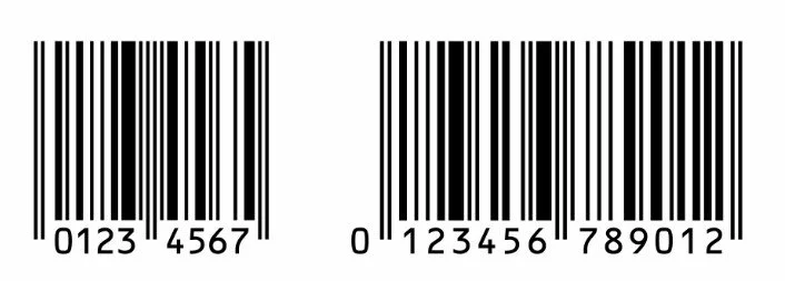
On the left is an EAN 8 with an EAN 13 on the right
Where things often fall down is in the application
Barcodes have regimented regulations around them to ensure seamless movement through the supply chain. There are specifications that must be complied with in order to pass verification and allow acceptance into the major chains (some retail chains require a verification report on your product before they will accept it). You cannot make a barcode any colour you want, size it or stretch it anyway you see fit. There are clear requirements, contrast, bar heights and widths and clear space all to take into account.
Best left to a professional if you are unsure of how these should be implemented. Barcodes are simple on face value but how to manage them can be quite technical.
Another thing often overlooked is the file type used for printing, avoid any web based file formats like jpg or png as these won’t print cleanly like a pdf or eps will and can affect the scannability of your barcode which can lead to failure of verification.
Verification isn’t very expensive and is something I recommend my clients do especially for the first product entering the supply chain, it’s worth it for the peace of mind alone and gives them confidence going forward that we’re compliant.
I have seen the consequences of a product being rejected from the supply chain while in a previous job. The client was forced to cover label ALL of their stock which of course lost them time, money and ultimately sales correcting the issue that shouldn’t have happened in the first place. Measure twice and cut once always!
As for those that try to be creative with barcodes, you know the one where they make them into fancy graphics etc. I understand the appeal (literally this was a task we had to do as a project in my design training way back in 2007!, how silly!) I would advise anyone to steer clear of that as it’s a recipe for disaster. Know the rules before you try and break them and then ask the question is there benefit in doing so? Highly unlikely.
If you’re interested in the EAN 13 Barcode specs you can find those here
We cover barcodes a bit in our packaging guide which you can grab right here