

Why Digital Design Skills Aren't Enough for Print Design
From Screen to Press
When you're ready to bring your brand to print, whether that's business cards, brochures, packaging, or signage you may well think "My website designer can handle this." Which seems logical. They understand your brand, they've created beautiful digital assets, and they know design. So what's the difference?
The difference is everything.
Print design and digital design operate under completely different rules. They require different technical knowledge, different skill sets, and different types of expertise. And here's what clients need to know: choosing the wrong designer for print can be costly in ways that digital mistakes simply aren't.
Here's what actually happens in many cases: A web designer confidently says "yes" to a print project because they want the work. They believe they understand design, and therefore, they understand print design. They might even have experience with colour, typography, and layout. But confidence isn't competence, and that's where things go wrong, like really wrong.
The dangerous part? Clients don't know the difference. You assume that if someone can design a beautiful website, they can design print materials. You assume they understand colour, file formats, and the technical requirements of printing. Ninety-nine per cent of the time, they don't and they might not even realise it.
This happens at every level. Freelance digital designers do it. In-house design teams do it. Even creative agencies often have designers who excel on screen but lack the technical print knowledge required to execute print properly and ask me how I know? Because I’ve had to upskill those in those roles and been baffled they were working on print or packaging without having the skills to begin with. Talk about rolling the dice.
The key differences between digital vs print design
Digital Design is Forgiving
In digital design, mistakes are easily fixed. Wrong colour? Change it with a click. Typography looks off on mobile? Adjust the CSS. File format not quite right? No problem. Most digital mistakes can be corrected in minutes, sometimes seconds, with very little financial consequence beyond the time spent fixing them.
This forgiving nature creates a problem. A digital designers don't necessarily develop the discipline or technical understanding required for print, because they've never had to, not their fault but they don’t know what they don’t know.
Print is quite the opposite. Once your materials leave the printing press, they're permanent. A colour that looks wrong in your branded collateral? That's thousands of printed pieces. A file set up incorrectly that causes registration issues? That's a reprint. Typography that renders incorrectly on a specific substrate? That's wasted inventory.
Print mistakes are costly. They're not "oopsy daisy, let me fix that" mistakes. They're "we need to reprint and suck up that cost" mistakes.
This fundamental difference is one is permanent versus flexibility means print design requires a completely different mindset and a specific set of technical skills. Unless they’ve worked in a print house or had specific pre-press training there isn’t a high chance that a web designer has those skills (they might but that’s what the checklist is for) Do it once, do it right as I like to say around here.
A quick checklist to ask any prospective hires
"What's your experience with print projects?" Listen for specifics, not generalities. Have they done similar projects?
"Can you explain your process for colour management in print?" They should be able to articulate this clearly.
"How do you handle file preparation and prepress?" Do they work with printers? Do they prepare files themselves?
"What happens if we find an issue with the files after they're sent to print?" A print designer will have thought about this and have a plan.
"Do you have a preferred printer, or will you work with mine?" Either answer is fine, but they should have a thoughtful response.
"Can you provide examples of printed work?" Ask to see actual printed pieces they've designed if you can.
Digital portfolios don't tell you if the print quality matches the design.
Print design and digital design are different disciplines. Both are valuable. Both require expertise. But they're not interchangeable.
If you're hiring someone to design print materials, make sure they have print expertise. Ask questions. Look for someone who understands CMYK, prepress, file specifications, and the relationship between design and printing production. Look for someone who treats print as a specialty, not an afterthought!
Your brand and your budget will most certainly thank you.
Looking to hire a print designer? Ask the right questions, look for the red and green flags, and prioritise technical expertise alongside creative skill because you need both for the best outcome.
Rebrands don’t often fail, but the thinking does.
Most rebrands don’t fail because the design is bad. They fail because the brand never was never clear on what the problem is they are trying to solve.
Design just ends up taking the blame.
If you’ve ever invested good money into a rebrand only to feel let down by the result, this is probably why.
Rebrands are usually triggered by an ongoing feeling of discomfort
Sales have stalled, the brand feels tired, the category feels crowded or something just isn’t working anymore (sound familiar?)
Instead of diagnosing the real issue, brands jump straight to the visible part of the solution. New logo. New packaging. New look.
It feels productive. It feels decisive but it skips the most important step, understanding what is actually broken.
A rebrand shouldn’t be a reset button. It should be a response to a specific problem. When that problem is unclear, the outcome will be too.
Why design becomes the scapegoat
When a rebrand disappoints, the critique can be pretty vague.
“It doesn’t feel right.”
“I expected more.”
“I’m not sure it’s us.”
These aren’t design problems. They are clarity problems and if you follow me on the gram you know how I feel about clarity. Clarity sells!
Without a clear definition of success, design becomes subjective. Everyone has an opinion. Stakeholders pull in different directions. Feedback turns into a battle of taste rather than objective judgement.
The brand may look different, but it doesn’t feel better and because design is the most visible part of the process, it takes the hit.
The brief is where most rebrands often go wrong
Most brands think they have a brief when in reality what they have is actually just a list of preferences.
“Make it more modern.”
“Elevate the brand.”
“Feel more premium.”
“Stand out more.”
These are opinions, not objectives. They describe a vibe, not a problem to solve. Vibes don’t pay the bills folks.
A strong brief doesn’t tell a designer what to make (contrary to popular assumption)
It tells them what the brand needs to achieve. Commercially, strategically, and behaviourally. The end objective leads the solution, not the other way around.
If the brief is vague, the outcome will be too. No amount of creative talent can compensate for lazy thinking.
What a rebrand is actually meant to achieve
A rebrand is not there to impress your internal stakeholders or chase clout with trends.
A rebrand should do very specific things:
Clarify what the brand stands for
Sharpen who the brand is for, and who it is not for
Improve decision-making at shelf or online
Support a clear tangible goal, not just aesthetic preference
If those outcomes are not defined upfront, the rebrand becomes cosmetic. It might look nicer, but it will not work harder for you.
Strategy is not a workshop
Strategy gets a bad reputation because it is often treated as theatre. Long decks, vague language, no clear output.
Good strategy is the opposite.
It removes subjectivity and speeds up decisions. It protects your brand from trend-chasing therefore increasing it’s longevity and it gives design something solid to amplify.
Strategy is not about overthinking. It is about making fewer, better decisions with confidence. I can’t stress this enough.
Some rebrands just slap right?
You’ve seen them. Rebrands that just land they were always meant to be.
They feel pretty obvious in hindsight. They make total sense. They move the brand forward instead of sideways.
This is rarely about insanely good design talent. It is usually because:
The problem was clearly defined
The goal was objective, not cosmetic
Fewer opinions were allowed to shitstorm the process
The brand knew what it was building towards
Clarity makes good design feel inevitable.
The real takeaway
Rebrands don’t often fail because brands chose the wrong designer. They fail because brands skip the hard thinking and expect design to fill the gaps.
Design should amplify clarity, not compensate for its absence. If you want a rebrand that works, you need to start by being brutally honest about what is not.
Rebrands shouldn’t be a knee jerk reaction and they need to be handled with care and diligence.
If you need a team that can handle yours with the utmost care hit that button below and I’ll be happy to chat about yours.
Make it stand out
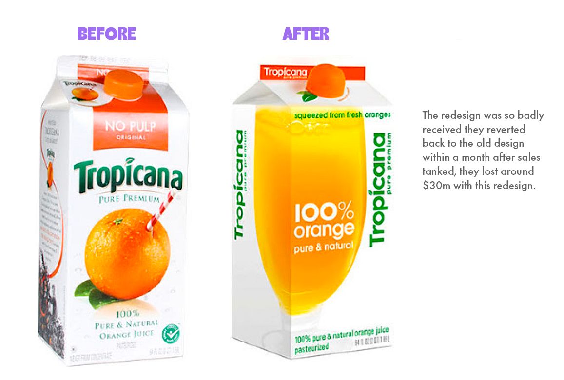
Tropicana removed all the elements that held strong bonds with their customers, the results were financially devastating. Change for change sake is never a good idea. Which is why rebrands have to be deeply rooted in strategic decision making first.
Brand need a refresh or a total rebrand? The key differences.
These two phrases are interwoven a lot but they are different things and one requires more time and resource than the other. Before you invest in a full rebrand ask the question? Can small strategic updates solve the problems we’re experiencing?
To put it short, a refresh is about fine-tuning what you have and a rebrand is about starting from scratch.
What is a rebrand?
A rebrand means undertaking a full overhaul of the brand identity—new name, new logo, new colour palette, and often a new positioning. It’s a bigger investment.
Why might there be a need to rebrand?
If the current brand has negative perceptions, you’re pivoting and entering an entirely new market or different offerings or there could be legal issues with the current brand around trademark etc. That last one is happening A LOT in NZ, please ensure if you really are taking your business seriously that you protect it, as the big players (even those in completely different categories) are sending cease and desists for those with similar names and they often know startups don’t have the money to fight them on it.
What is a brand refresh?
Strategic updates to your existing brand assets—logo tweaks, colour adjustments, packaging updates, messaging improvements. The goal is to modernise, clarify, or optimise without losing recognition.
Why might there be a need for a brand refresh?
Your brand may have lost consistency across platforms, the logo or packaging maybe recognisable but now looks dated. You could be entering a new product range or market or it could be as simple as the product you have is great but it’s not selling as expected.
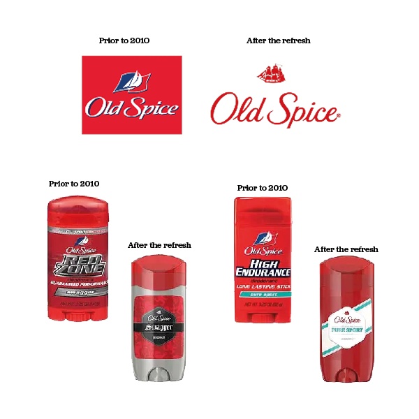
A great example of bringing a brand a brand back to life is evident with Old Spice (everyone remembers old spice right?) prior to 2010 they had become redundant and seen as ‘the old mans deodorant’, in rides 2010 on it’s high horse and they gave the brand a complete refresh updating the visual identity of their packaging and aligning it more to the 18-34 yo male demographic. They repositioned, modernised and change their brand messaging. The result? Only a measly +125% growth in sales and an increase of 3% of the market share in the body wash category. Sheesh Old Spice do better (yes I’m being sarcastic) but you see what I mean. Done well, a refresh can be game changing for a business, not to go on but Crocs is another that comes to mind in more recent years but you’ll still never pay me enough to own a pair of those ugly bloody things!
If you’re unsure what direction you should take or whether you need to take one at all, feel free to email us at and we can line a time up to touch base. It’s a big decision and as we said at the beginning, change for the sake of change is not a good enough reason. We want all our projects to see tangible results so if we don’t feel it’s the right thing that’s what we’ll tell you. Straight from the hip? yes that’s us, because ultimately our success stems from our clients success and that is always front and center for us.
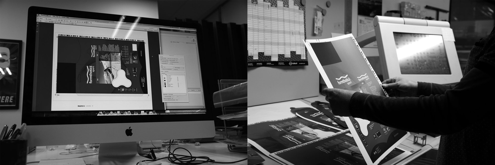
Confessions of a Former Pre-Press Operator: What I Wish You Knew
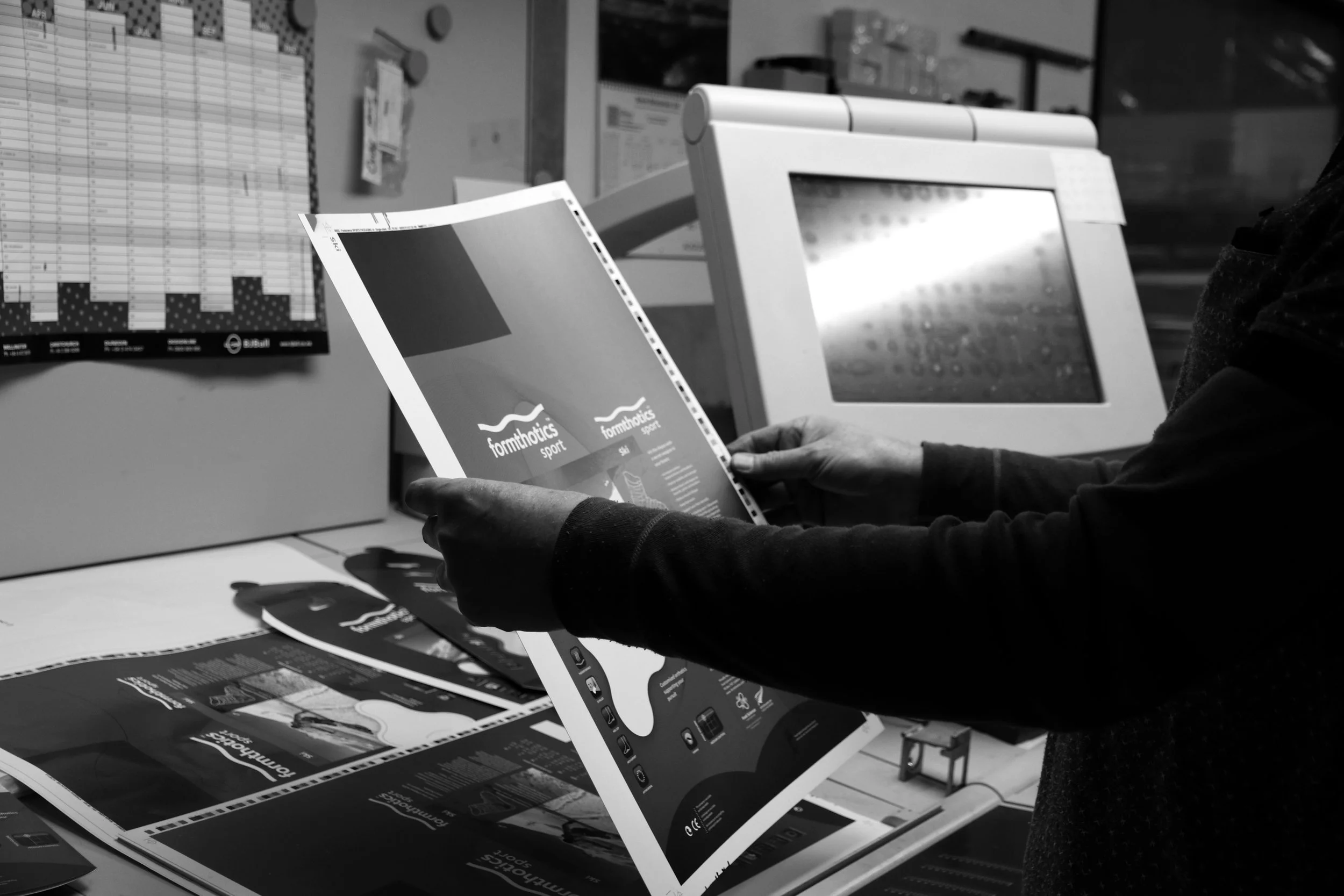
I spent a decade in pre-press. That means I’ve seen every packaging disaster you can imagine before it hit the shelves. I’ve fixed hundreds of hot messes, quietly saved brands from embarrassment, and sometimes… watched train wrecks in slow motion because it was too late to stop them. You know who supplied the worst files? It pains me to say but it was always agency designers.
Here’s what I wish you knew
Your file is not ready just because it looks good on screen
CMYK doesn’t care about your fancy gradient. That orange? It’ll look like dirt (hot tip: Use a fricken pantone) Pre-press exists to avoid unexpected outputs.Printers are not mind-readers
If you don’t supply clear dielines, bleed, and correct colour profiles, the printer has to guess. Guesswork is the enemy of brand consistency.Packaging is an unforgiving medium
What looks perfect on your laptop can warp, stretch, or misalign on a 3D surface. Pre-press catches that before you pay for 20,000 units of a shitshow. Also, be wary that what you see on your laptop may look entirely different because of screen calibrations. Always sign off on a physical proof from the printer.Typography has a breaking point
Tiny legal text, hairline fonts, overly thin strokes – they might be fine in your PDF, but in print, they can blur, fill in, or disappear entirely. Pre-press fixes that before it costs you compliance or your credibility.Skipping pre-press costs more than paying for it
I’ve seen brands lose weeks (and thousands) because they had to reprint. It’s cheaper to get it right the first time.
At Preflight Creative we know how crucial this undervalued skill is, so we don’t treat pre-press like a boring admin step. It’s where your design is bulletproofed for the real world. After ten years behind the curtain, I can tell you – this step makes the difference between a design you love and a design you regret.
Tempted to copy another brands style?
If you follow us on socials you’ve definitely heard me say ‘the sea of same’ and that is not where you want your brand to be my friends.
I witnessed exactly this (glaringly so) in my local chemist. Two bar brands - so similar that I mistake the new one for my favourite brand. The colours, the minimalist style, font choice, EVERYTHING. Not to mention, they were stacked vertically next to each other. If you take nothing away from this, take this:
If you confuse, you lose.
This isn’t just a coincidence. It’s a classic FMCG mistake. And it’s costing brands more than they realise.
So why do brands do this? fear and laziness put simply, but there’s more to it
The long answer is they’re chasing trends, choosing to follow someone else’s roadmap of success instead of what the right choice is for their brand positioning (do they have one?), which leads me to the next point.
Lack of brand strategy
Without identifying who you are, what you stand for and why you’re different then it’s easy to just jump on board with what you already see working in your niche.
It’s also really easy with internal teams or big agencies to get caught in a bit of echo chamber thinking. Everyone is looking at the same competitors, referencing the same trends.
So why is it bad for business?
This isn’t rocket science, if your product looks the same as the one next to it you’ve become a commodity.
So that means you’re not memorable, and that’s bad news for your margins and your brand in the long term.
3 things are likely to happen here:
You’ll be competing on price
You’ll confuse your customer
You cheapen and weaken your brand
Remember, nobody remembers the runner up in the lookalike contest you know it.
In FMCG it’s crucial to differentiate; that is the key to survival. If you look like everyone else, you’ve already lost half the battle, and it doesn’t matter how good your product is.
Your packaging is selling your product when you’re not there to so don’t underestimate its importance.
So how do you stand out on shelf?
You lead with strategy first, every design decision should align with a clear brand position. Design helps position your product. Your brand will be positioned in the eyes of the consumer, whether you like it or not. Utilising strategy in the design process helps position it where you want it to be.
The goal isn’t just to be on the shelf, it’s to be the chosen one.
This is why we refuse to lean into cookie-cutter design, our motto is always ‘lean into what makes your brand different’, taking the path less followed helps you cut through in saturated markets. Don’t be afraid to stand out, be afraid to blend in.
Your logo is not a novel
A responsive logo suite
I’ve seen it countless times, people posting their logos in a Facebook group or asking for feedback in a business forum, you’ve probably seen it happen yourself. Cue a dozen comments gushing over how “detailed” or “unique” it looks.
Here’s the thing, they’re all damn wrong.
Over-designed logos are killing small brands before they’ve even had a chance to grow.
At Preflight Creative, we’ve worked with enough businesses, and it doesn’t matter their industry, we see the same mistake repeated over and over: trying to tell your whole brand story through your logo alone.
Spoiler Alert: It doesn’t work.
There is a reason simple logos just work better, and simple does not have to mean dull my friends. Hear me out…
A logo isn’t meant to say everything and nor should it try. It’s a symbol, a shorthand, a recognisable anchor that builds familiarity and trust over time.
Think business cards, Instagram profile pics, shipping boxes, embroidery, and bottle caps. If your logo relies on tiny flourishes or layered gradients to “work”, it won’t. Simplicity ensures legibility whether it’s blown up on a billboard or shrunk down to 16 pixels (and it will be shrunk to 16px, believe me)
The most iconic brands in the world have simple logos: Nike, Apple, Chanel. Why? Because simplicity sticks. Your audience should be able to sketch your logo from memory, not need a magnifying glass to read it let alone understand it.
Embossing, debossing, foiling, screen printing, digital, every medium has constraints of some kind. The more complex your logo, the more compromises you’ll face in production. Simple logos hold their ground in any format.
When a logo tries to “say it all”, it ends up saying nothing. The real work of branding happens in your tone of voice, your packaging, your messaging, and how you show up across platforms.
A logo supports your brand, but it doesn’t carry the whole thing.
Let’s think of it as if it were a house; the logo is the front door. It’s not the whole kit and kaboodle, so stop expecting it to do all the heavy lifting without the support it needs to help your business shine.
This is why we build brand identity systems and not just logos alone; we know you need the supporting acts to build the full picture of your business to your audience. It would be a disservice to our clients to sell them something we know is not the right solution, so we will not do that.
We only build fully responsive brand packages that ensure you have a logo suite that can perform all the tasks without trouble. That means asking the right strategic questions, understanding your audience, and building a visual identity system that can evolve with your business, not restrict it.
Now, look, if you’ve made this oversight, you are not alone; we can help you create something that’s problem-free and still uniquely your brand. Feel free to browse our branding packages here and have faith in 2 of our packages carrying our Project Assurance Policy. You have nothing to lose and everything still to gain.
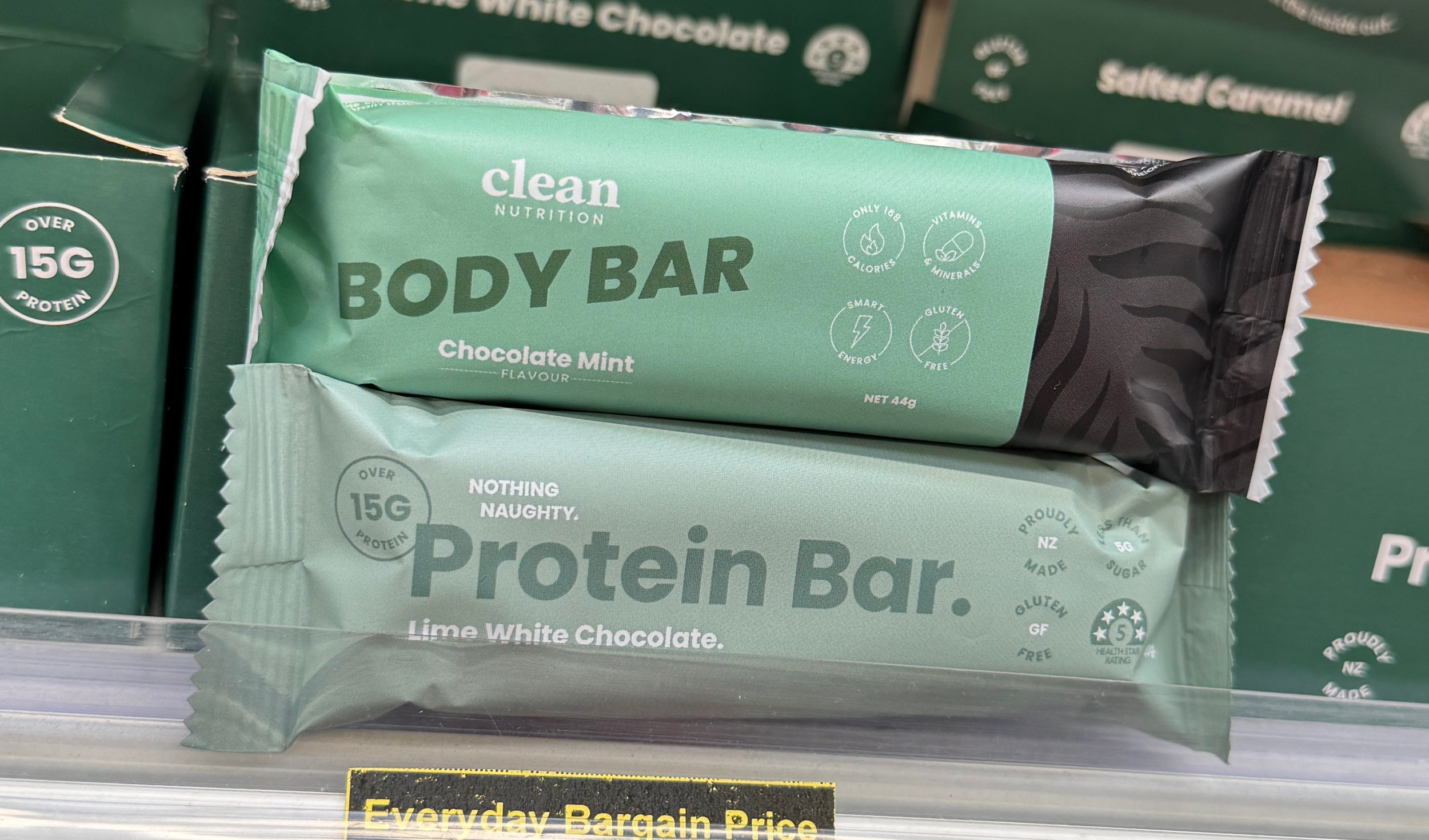
E-Commerce VS Retail Packaging Design Considerations
Why one size doesn’t fit all
Here’s something many business owners find out the hard way. Designing for e-commerce and designing for the retail shelf space require quite different approaches.
These two channels are completely different environments. Your packaging isn’t just there to look good, it has a job to do, and that job changes depending on where your product ends up. Graphic Design doesn’t exist just to make things look pretty, it requires design strategy implementation to be truly effective.
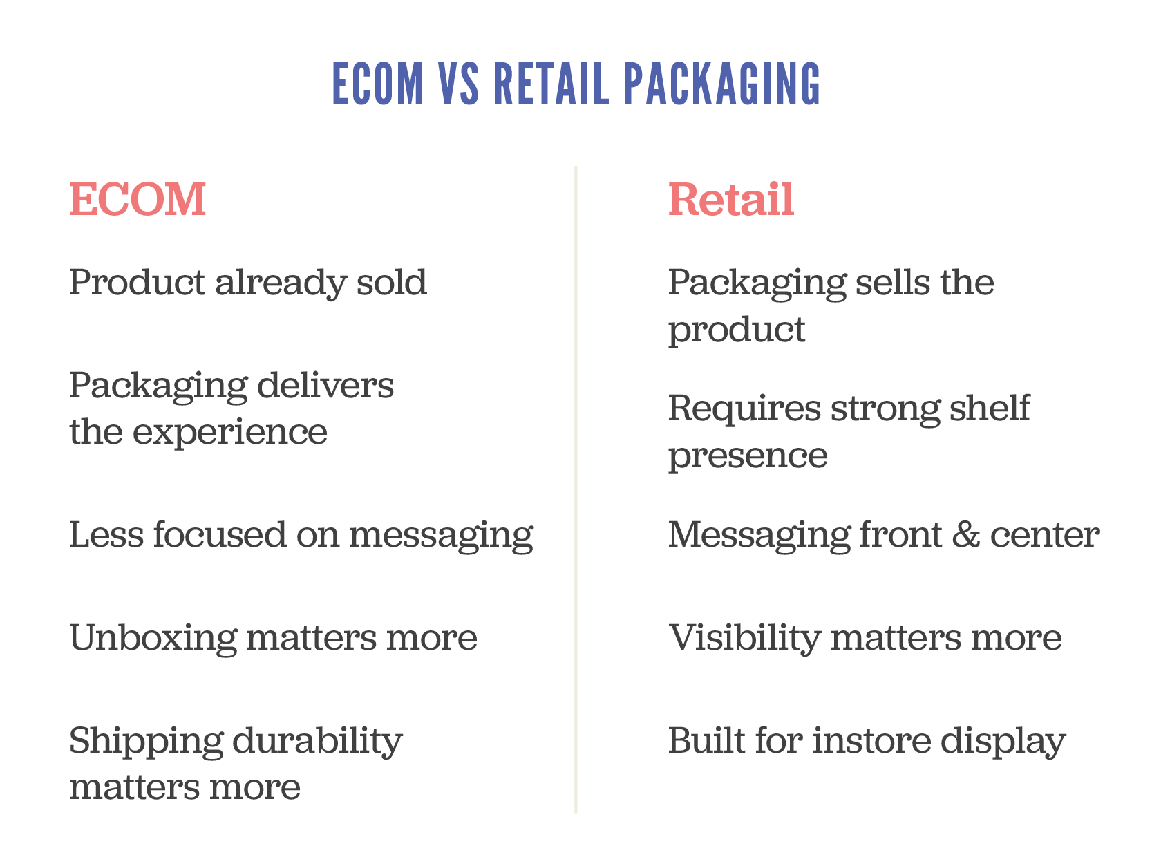
Let’s break down the key differences so you can ensure you plan accordingly and avoid costly mistakes from day one.
Firstly, your first impression works a bit differently
In-store
Your packaging is the first impression. It’s up against a sea of competitors, fighting for attention in seconds. If it doesn’t grab someone quickly, kiss goodbye to the sale, my friends.
E-commerce: The sale has already happened. Your packaging arrives after the click, making it less about persuading and more about that impression at the door. This is your chance to reinforce your brand and create a memorable unboxing moment. You’ve seen the videos on social of people raving about their purchases, take notes my friend.
The differences
In-store needs to attract attention. E-commerce needs to deliver an experience.
Secondly, your hierarchy of information needs to shift
Retail shelf packaging needs to communicate fast and clearly a number of things:
What is the product?
Who is it for?
Why should I give a shit?
What the key features of benefits are?
For online stores, the heavy lifting has already been done by your website or marketplace listing. Your packaging can afford to strip back the sell and lean into storytelling, tone of voice, and visual impact.
Avoid the common mistake of trying to cram all your retail messaging into an e-comm pack.
You’ll end up with clutter that confuses instead of converting. Consumers are lazy beings; treat them accordingly and make it simple AF.
Retail is about standing out visually, e-commerce is about pinpoint presentation
On shelf, your packaging may be stacked, lying flat, or only partially visible. It has to work from multiple angles and grab attention fast. This is where smart use of colour, layout and shape makes a real difference.
Online, you control the product photo, but your customer still interacts with the physical pack when it arrives at their door. Think about how it opens, whether it feels premium (if the price point is high on the item), and whether the structure helps protect and present the product well.
Design for the journey, not just the destination
Retail packs sit on shelves, possibly handled by a few customers. They need to be tidy and tamper-proof, but not bulletproof.
E-commerce packs go through warehouses, vans, sorting depots, and who knows what before reaching the buyer. If your packaging can’t take a few knocks, you’ll end up with broken products, refund requests, and bad reviews.
Spend the money where it matters
Retail packaging often benefits from premium finishes like foil, embossing or spot UV. I’ve made myself hoarse saying this but it really is your silent salesperson, and it needs to impress. If you disagree with that statement, then you haven’t unlocked the potential there is for your product when your packaging is designed rooted in a strategic approach. No design is done on a whim; if your designer can’t justify the ‘why’ in what they’ve presented to you, they’re not the right person to move the needle for your business.
E-commerce packaging might not need all the bells and whistles especially if the customer bins it minutes after opening. A well-designed insert, printed tissue paper, or branded seal can have more emotional impact than a fancy box.
Be strategic, not just stylish.
So what should startups do?
Start by asking this very simple question
Where is my customer encountering my product first?
If you’re selling online only, focus on the unboxing experience and protective design.
If you’re going into retail, create shelf-ready packaging with a strong disruptive visuals and clear messaging
If you’re doing both, be prepared to develop two packaging solutions, or work with a designer who can build in smart flexibility.
I’ll leave you with some parting thoughts. Good packaging isn’t just pretty. It’s a key part of your customer experience and your product’s performance.
Design for the sales channel, not just the product. Understand the difference between selling on shelf and selling at the doorstep, and design accordingly.
As a specialist packaging design agency we can help if you’re unsure on how to move forward with the decisions around your packaging. Just sing out!
Download our Packaging Guide
If you’re looking to organise packaging for your product, grab our packaging guide for tips and tricks and a handy checklist to ensure you don’t overlook anything and avoid costly mistakes and delays
Inside the Mind of an FMCG Category Buyer
What are the Key Factors Influencing Buyer Decisions
If your ultimate goal is to get your product into retail, here’s something you need to know: packaging is almost everything. A category buyer will often make their decision in just a couple of seconds, and packaging plays a massive role, about 60% of their decision-making process (said by them, not me!)
So, what exactly are they looking for, and what trends are shaping the FMCG space? Let’s unpack it shall we.
I recently spent a few days on a print summit with some pretty amazing presenters from all over the world who sat down with different category buyers and quizzed them on their decision-making process.
I’ve given a relatively quick rundown of the nuggets of gold I gathered over those few days.
Retail is Like Tinder: First Impressions Matter
Category buyers don’t have time to deliberate over every product—they’re swiping left or right in seconds. On-shelf decisions happen fast, typically within 1–2 seconds. That means your packaging needs to stand out and communicate the right message instantly.
What is making the biggest impact at the moment?
Colour & typography – Your brand needs to pop off the shelf while remaining category-appropriate. Catchy, well-thought-out fonts and colour palettes can be the difference between a yes and a no.
Clear hierarchy – Shoppers don’t have time to decipher cluttered designs. Prioritise key information so it’s digestible at a glance. For health products, for example, benefits should be front and centre.
Great Packaging Gets You In but The Product Keeps You There
A stunning design can get your product into a buyer’s cart, but if the product doesn’t deliver, they won’t buy again. Retailers don’t want products that sit on shelves—they need consistent sales. If your product isn’t moving, it’s out.
Key design features buyers are loving right now
Beyond the basics of strong visuals and clear messaging, here are some key features retail buyers are drawn to:
Textural finishes – Matte coatings, embossing, and foil accents add a premium feel and invite interaction.
Clever storytelling & copy – Messaging that resonates with Millennials and Gen Z is essential. These shoppers are drawn to authenticity and personality.
Visibility – If a product can be partially seen through its packaging, it builds trust. This is especially effective for food, beauty, and craft brands.
The Top Packaging Trends Right Now
Here’s what’s working—and what’s not—in FMCG packaging today:
Winning Trends:
Big, bold, and bright – Eye-catching designs with customised typography are standing out.
Hand-drawn illustrations – Clean, hand-drawn elements that elevate craft-based products.
See-through packaging – Giving consumers a peek at what they’re buying builds confidence.
Fading Trends:
Minimalism gone wrong – Overly simplistic designs can look generic, failing to capture attention in the crucial 2–3 second window.
Greenwashing – Consumers and buyers are tired of vague sustainability claims. If sustainability is your core value, show it through action, not just messaging.
Overloaded design – Loud, chaotic packaging might grab attention initially, but if it’s too hard to interpret quickly, consumers move on.
Final Thoughts
The takeaway? Packaging isn’t just about looking good—it’s about instantly communicating value, standing out, and making a buyer’s decision easy. With only a second or two to capture attention, your design needs to work hard to ensure your product gets picked up—and stays stocked.
Looking to refine your FMCG packaging to ensure retail success? Get in touch—we know how to get you there.