

Your logo is not a novel
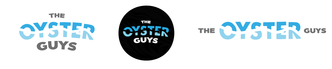
A responsive logo suite
I’ve seen it countless times, people posting their logos in a Facebook group or asking for feedback in a business forum, you’ve probably seen it happen yourself. Cue a dozen comments gushing over how “detailed” or “unique” it looks.
Here’s the thing, they’re all damn wrong.
Over-designed logos are killing small brands before they’ve even had a chance to grow.
At Preflight Creative, we’ve worked with enough businesses, and it doesn’t matter their industry, we see the same mistake repeated over and over: trying to tell your whole brand story through your logo alone.
Spoiler Alert: It doesn’t work.
There is a reason simple logos just work better, and simple does not have to mean dull my friends. Hear me out…
A logo isn’t meant to say everything and nor should it try. It’s a symbol, a shorthand, a recognisable anchor that builds familiarity and trust over time.
Think business cards, Instagram profile pics, shipping boxes, embroidery, and bottle caps. If your logo relies on tiny flourishes or layered gradients to “work”, it won’t. Simplicity ensures legibility whether it’s blown up on a billboard or shrunk down to 16 pixels (and it will be shrunk to 16px, believe me)
The most iconic brands in the world have simple logos: Nike, Apple, Chanel. Why? Because simplicity sticks. Your audience should be able to sketch your logo from memory, not need a magnifying glass to read it let alone understand it.
Embossing, debossing, foiling, screen printing, digital, every medium has constraints of some kind. The more complex your logo, the more compromises you’ll face in production. Simple logos hold their ground in any format.
When a logo tries to “say it all”, it ends up saying nothing. The real work of branding happens in your tone of voice, your packaging, your messaging, and how you show up across platforms.
A logo supports your brand, but it doesn’t carry the whole thing.
Let’s think of it as if it were a house; the logo is the front door. It’s not the whole kit and kaboodle, so stop expecting it to do all the heavy lifting without the support it needs to help your business shine.
This is why we build brand identity systems and not just logos alone; we know you need the supporting acts to build the full picture of your business to your audience. It would be a disservice to our clients to sell them something we know is not the right solution, so we will not do that.
We only build fully responsive brand packages that ensure you have a logo suite that can perform all the tasks without trouble. That means asking the right strategic questions, understanding your audience, and building a visual identity system that can evolve with your business, not restrict it.
Now, look, if you’ve made this oversight, you are not alone; we can help you create something that’s problem-free and still uniquely your brand. Feel free to browse our branding packages here and have faith in 2 of our packages carrying our Project Assurance Policy. You have nothing to lose and everything still to gain.
E-Commerce VS Retail Packaging Design Considerations
Why one size doesn’t fit all
Here’s something many business owners find out the hard way. Designing for e-commerce and designing for the retail shelf space require quite different approaches.
These two channels are completely different environments. Your packaging isn’t just there to look good, it has a job to do, and that job changes depending on where your product ends up. Graphic Design doesn’t exist just to make things look pretty, it requires design strategy implementation to be truly effective.
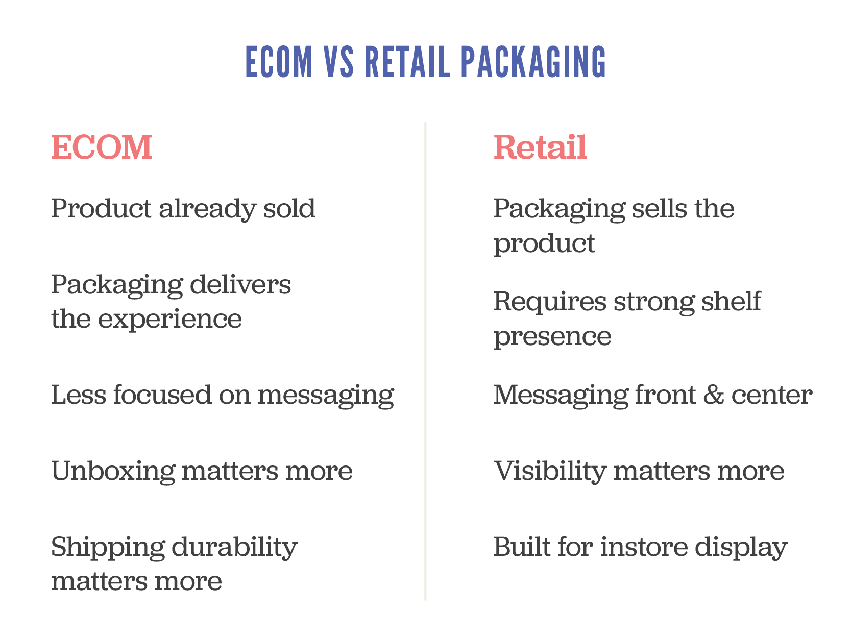
Let’s break down the key differences so you can ensure you plan accordingly and avoid costly mistakes from day one.
Firstly, your first impression works a bit differently
In-store
Your packaging is the first impression. It’s up against a sea of competitors, fighting for attention in seconds. If it doesn’t grab someone quickly, kiss goodbye to the sale, my friends.
E-commerce: The sale has already happened. Your packaging arrives after the click, making it less about persuading and more about that impression at the door. This is your chance to reinforce your brand and create a memorable unboxing moment. You’ve seen the videos on social of people raving about their purchases, take notes my friend.
The differences
In-store needs to attract attention. E-commerce needs to deliver an experience.
Secondly, your hierarchy of information needs to shift
Retail shelf packaging needs to communicate fast and clearly a number of things:
What is the product?
Who is it for?
Why should I give a shit?
What the key features of benefits are?
For online stores, the heavy lifting has already been done by your website or marketplace listing. Your packaging can afford to strip back the sell and lean into storytelling, tone of voice, and visual impact.
Avoid the common mistake of trying to cram all your retail messaging into an e-comm pack.
You’ll end up with clutter that confuses instead of converting. Consumers are lazy beings; treat them accordingly and make it simple AF.
Retail is about standing out visually, e-commerce is about pinpoint presentation
On shelf, your packaging may be stacked, lying flat, or only partially visible. It has to work from multiple angles and grab attention fast. This is where smart use of colour, layout and shape makes a real difference.
Online, you control the product photo, but your customer still interacts with the physical pack when it arrives at their door. Think about how it opens, whether it feels premium (if the price point is high on the item), and whether the structure helps protect and present the product well.
Design for the journey, not just the destination
Retail packs sit on shelves, possibly handled by a few customers. They need to be tidy and tamper-proof, but not bulletproof.
E-commerce packs go through warehouses, vans, sorting depots, and who knows what before reaching the buyer. If your packaging can’t take a few knocks, you’ll end up with broken products, refund requests, and bad reviews.
Spend the money where it matters
Retail packaging often benefits from premium finishes like foil, embossing or spot UV. I’ve made myself hoarse saying this but it really is your silent salesperson, and it needs to impress. If you disagree with that statement, then you haven’t unlocked the potential there is for your product when your packaging is designed rooted in a strategic approach. No design is done on a whim; if your designer can’t justify the ‘why’ in what they’ve presented to you, they’re not the right person to move the needle for your business.
E-commerce packaging might not need all the bells and whistles especially if the customer bins it minutes after opening. A well-designed insert, printed tissue paper, or branded seal can have more emotional impact than a fancy box.
Be strategic, not just stylish.
So what should startups do?
Start by asking this very simple question
Where is my customer encountering my product first?
If you’re selling online only, focus on the unboxing experience and protective design.
If you’re going into retail, create shelf-ready packaging with a strong disruptive visuals and clear messaging
If you’re doing both, be prepared to develop two packaging solutions, or work with a designer who can build in smart flexibility.
I’ll leave you with some parting thoughts. Good packaging isn’t just pretty. It’s a key part of your customer experience and your product’s performance.
Design for the sales channel, not just the product. Understand the difference between selling on shelf and selling at the doorstep, and design accordingly.
As a specialist packaging design agency we can help if you’re unsure on how to move forward with the decisions around your packaging. Just sing out!
Download our Packaging Guide
If you’re looking to organise packaging for your product, grab our packaging guide for tips and tricks and a handy checklist to ensure you don’t overlook anything and avoid costly mistakes and delays
Inside the Mind of an FMCG Category Buyer
What are the Key Factors Influencing Buyer Decisions
If your ultimate goal is to get your product into retail, here’s something you need to know: packaging is almost everything. A category buyer will often make their decision in just a couple of seconds, and packaging plays a massive role, about 60% of their decision-making process (said by them, not me!)
So, what exactly are they looking for, and what trends are shaping the FMCG space? Let’s unpack it shall we.
I recently spent a few days on a print summit with some pretty amazing presenters from all over the world who sat down with different category buyers and quizzed them on their decision-making process.
I’ve given a relatively quick rundown of the nuggets of gold I gathered over those few days.
Retail is Like Tinder: First Impressions Matter
Category buyers don’t have time to deliberate over every product—they’re swiping left or right in seconds. On-shelf decisions happen fast, typically within 1–2 seconds. That means your packaging needs to stand out and communicate the right message instantly.
What is making the biggest impact at the moment?
Colour & typography – Your brand needs to pop off the shelf while remaining category-appropriate. Catchy, well-thought-out fonts and colour palettes can be the difference between a yes and a no.
Clear hierarchy – Shoppers don’t have time to decipher cluttered designs. Prioritise key information so it’s digestible at a glance. For health products, for example, benefits should be front and centre.
Great Packaging Gets You In but The Product Keeps You There
A stunning design can get your product into a buyer’s cart, but if the product doesn’t deliver, they won’t buy again. Retailers don’t want products that sit on shelves—they need consistent sales. If your product isn’t moving, it’s out.
Key design features buyers are loving right now
Beyond the basics of strong visuals and clear messaging, here are some key features retail buyers are drawn to:
Textural finishes – Matte coatings, embossing, and foil accents add a premium feel and invite interaction.
Clever storytelling & copy – Messaging that resonates with Millennials and Gen Z is essential. These shoppers are drawn to authenticity and personality.
Visibility – If a product can be partially seen through its packaging, it builds trust. This is especially effective for food, beauty, and craft brands.
The Top Packaging Trends Right Now
Here’s what’s working—and what’s not—in FMCG packaging today:
Winning Trends:
Big, bold, and bright – Eye-catching designs with customised typography are standing out.
Hand-drawn illustrations – Clean, hand-drawn elements that elevate craft-based products.
See-through packaging – Giving consumers a peek at what they’re buying builds confidence.
Fading Trends:
Minimalism gone wrong – Overly simplistic designs can look generic, failing to capture attention in the crucial 2–3 second window.
Greenwashing – Consumers and buyers are tired of vague sustainability claims. If sustainability is your core value, show it through action, not just messaging.
Overloaded design – Loud, chaotic packaging might grab attention initially, but if it’s too hard to interpret quickly, consumers move on.
Final Thoughts
The takeaway? Packaging isn’t just about looking good—it’s about instantly communicating value, standing out, and making a buyer’s decision easy. With only a second or two to capture attention, your design needs to work hard to ensure your product gets picked up—and stays stocked.
Looking to refine your FMCG packaging to ensure retail success? Get in touch—we know how to get you there.
Stop Burying the Good Stuff on Your Packaging
We’ve all seen them, those bold promises, the eco-friendly stamps, the endless buzzwords. Brands love them. But here’s the brutal (and honest truth) most brands are getting it wrong.
Having the right claims on your packaging is important. But having them in the right order? That’s where the real nugget of gold is.
The problem with overloading the pack
Brands often treat packaging like a billboard for every single thing they want you to know. The result? Customers are hit with a wall of text and logos, left squinting at the shelf trying to work out what the hell you are trying to tell them. Spoiler: many just won’t bother.
If you’re leading with certifications, niche ingredients, or a long-winded brand story then key elements like taste, health benefits, or convenience are buried under your layers of marketing waffle – you’re losing sales. It’s as simple as that.
Claims matter BUT accuracy matters more
Let’s get one thing straight: every claim you make needs to be accurate. This isn’t just about avoiding legal issues (although, that’s obviously pretty bloody important). Consumers are more switched on. If they sense you’re bending the truth or bullshitting them on what your product delivers, the trust is gone – and once it’s gone, it’s near impossible to get back (sounds a bit like a relationship a bit eh, because it is!).
Misleading claims might gain attention short-term, but they will damage your brand long-term.
Regulations aside, customers talk. If what’s on the pack doesn’t match what’s inside, social media will hear about it and I dare say not ALL publicity is good publicity, depends on who you ask I guess.
Which claims actually matter to consumers?
The big question: what do people actually care about when they’re standing in front of your product? It depends on your audience, but here are some that often carry the most weight:
Taste
Let’s not overcomplicate it – people buy food because they want it to taste good. If you’re leading with every ethical certification under the sun but they’ve no clue if it’s actually enjoyable, you’ve missed the mark.
Benefits
We’re all a bit more health-conscious these days. Whether it’s high protein, low sugar, or packed with vitamins – if it’s genuinely better for them, shout about it (metaphorically speaking)
Convenience
Quick, easy, on-the-go? Busy shoppers love it. If your product fits into their hectic day, make that crystal clear.
Sustainability
Consumers do care about the planet – but it’s got to feel authentic, we’ve all had enough of Greenwashing BS. Saying you’re 'eco-friendly' without any proof? That won’t fly. Be specific – recyclable packaging, carbon neutral, or sustainably sourced ingredients. Real, clear actions.
Free-From Claims
Dairy-free, gluten-free, vegan – these can be make-or-break for certain shoppers. But don’t let it overshadow the basics like taste and quality.
Getting your claim hierarchy right
Knowing your audience is everything. What do they value most? Start there.
Your claims should follow their priorities – not yours.
Think of your packaging like a conversation:
What’s the first thing they need to know? (Taste, benefit, or convenience)
What’s the reassurance they’re looking for? (Sustainability, quality, free-from)
What’s the extra detail if they want to know more? (Certifications, backstory)
Final thoughts
Your packaging is your silent salesperson. It’s got 3-4 seconds to do the job so make sure it’s saying the right things, in the right order.
Prioritise the claims that matter. Ensure every single one is accurate. And, above all, remember – no one’s buying your product just because you think it’s great. They’re buying it because it solves a need in their life.
Show them that, first and foremost.
Need help getting your packaging to actually work for your brand?
That’s kind of our thing. Get in touch – let’s crack on with it.
Deciphering Barcode Regulations
This one is inspired by Small Business FB groups! Constantly being asked about and the wrong information being given has poked this bear one too many times! They may just appear as lines and numbers to the untrained eye. To the trained eye however they’re the keys to growth in your business and supply chain acceptance.
Let’s dive into it.
If you’re NZ or Aus based your barcode authority is GS1. They should be your first and only stop.
Head here for NZ or Here for Aus.
I will add there are 3rd party providers but do yourself a favour and skip those, they’re just middlemen and it’s far more painless and cost effective dealing with GS1 direct.
Pretty much every barcode on products found in NZ or Aus feature an EAN-13 or an EAN-8 barcode. EAN is the standard here, don’t let anyone tell you different. Which you will get depends on the size of your product. Most are EAN-13 and only if your product is small enough will an EAN-8 be allocated to you. They will also supply the GTIN numbers you need for any external shipper boxes.
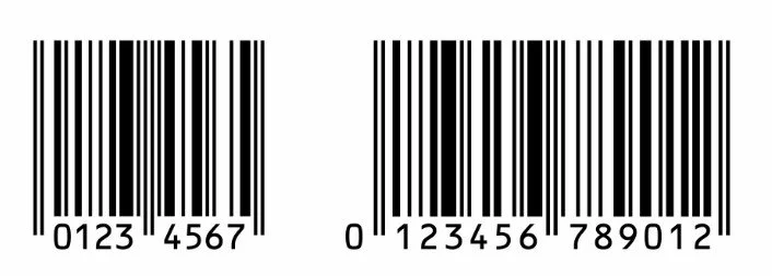
On the left is an EAN 8 with an EAN 13 on the right
Where things often fall down is in the application
Barcodes have regimented regulations around them to ensure seamless movement through the supply chain. There are specifications that must be complied with in order to pass verification and allow acceptance into the major chains (some retail chains require a verification report on your product before they will accept it). You cannot make a barcode any colour you want, size it or stretch it anyway you see fit. There are clear requirements, contrast, bar heights and widths and clear space all to take into account.
Best left to a professional if you are unsure of how these should be implemented. Barcodes are simple on face value but how to manage them can be quite technical.
Another thing often overlooked is the file type used for printing, avoid any web based file formats like jpg or png as these won’t print cleanly like a pdf or eps will and can affect the scannability of your barcode which can lead to failure of verification.
Verification isn’t very expensive and is something I recommend my clients do especially for the first product entering the supply chain, it’s worth it for the peace of mind alone and gives them confidence going forward that we’re compliant.
I have seen the consequences of a product being rejected from the supply chain while in a previous job. The client was forced to cover label ALL of their stock which of course lost them time, money and ultimately sales correcting the issue that shouldn’t have happened in the first place. Measure twice and cut once always!
As for those that try to be creative with barcodes, you know the one where they make them into fancy graphics etc. I understand the appeal (literally this was a task we had to do as a project in my design training way back in 2007!, how silly!) I would advise anyone to steer clear of that as it’s a recipe for disaster. Know the rules before you try and break them and then ask the question is there benefit in doing so? Highly unlikely.
If you’re interested in the EAN 13 Barcode specs you can find those here
We cover barcodes a bit in our packaging guide which you can grab right here
Packaging Redesign: When & Why You Should Refresh Your Product Packaging?
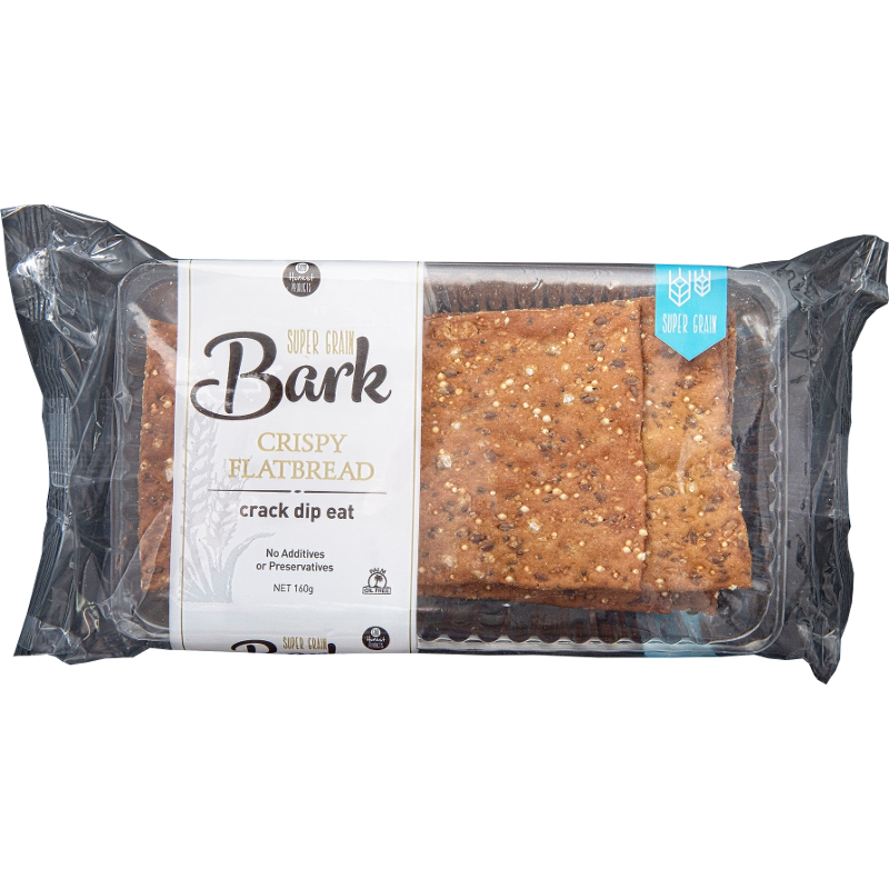
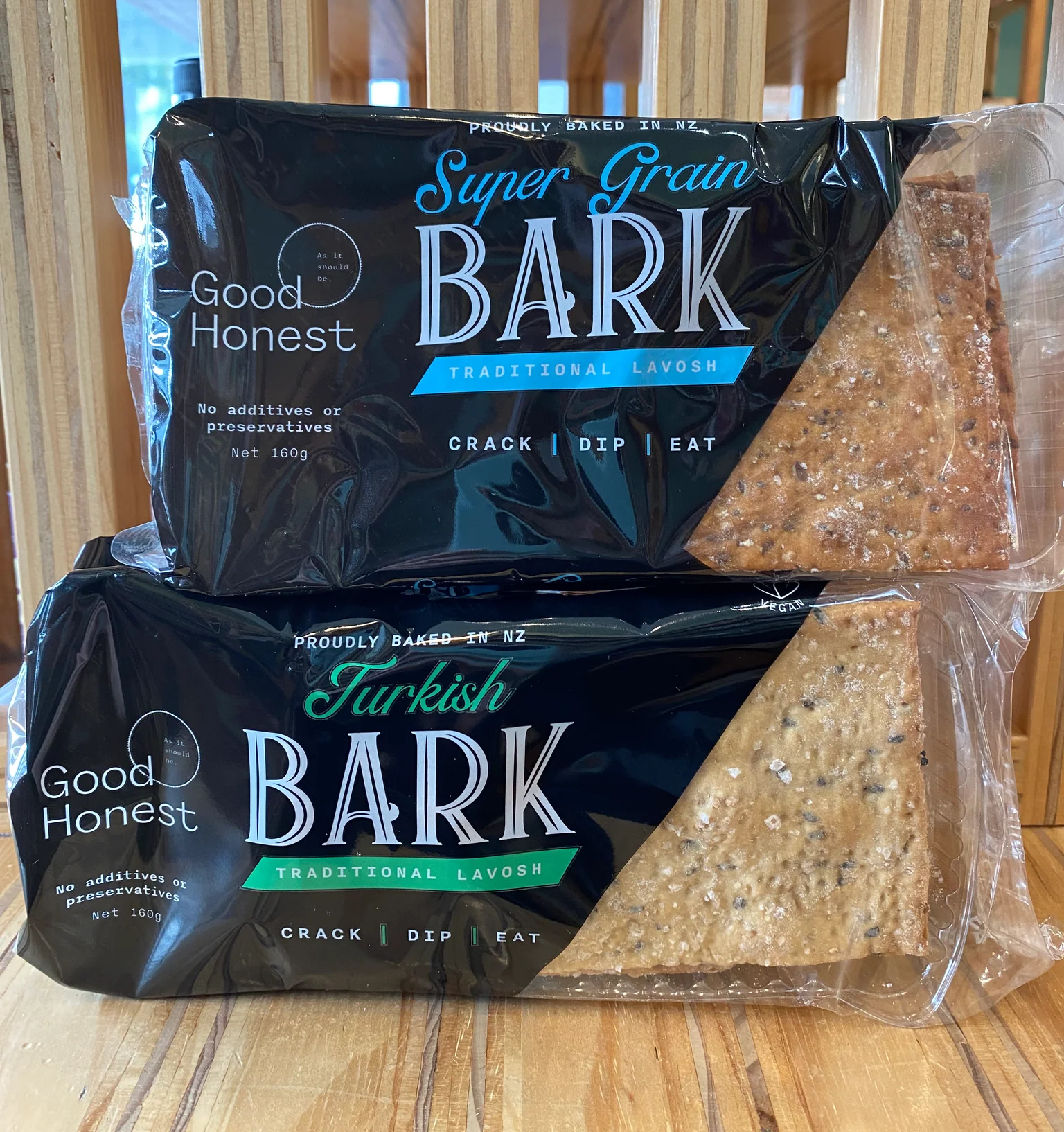
Good Honest Bark underwent a total refresh: Left - Old, Right - New. You’ll find them in your local New World
Ever wondered if your packaging is still pulling its weight? If you’re contemplating it isn’t then that tells you already that it’s letting you down. The truth is, packaging can make or break that all-important first impression with your customers.
A well-timed refresh can do wonders, but redesigning your packaging isn’t a decision to make lightly. Let’s look at when a redesign is worth considering and the steps to take when you’re ready to get stuck in.
Key Indicators for a Packaging Refresh
One of the biggest reasons to redesign is that your target audience has evolved. Your original packaging might have been perfect for your launch, but is it still hitting home with your current customers? If the look and feel of your brand has moved on, or you’re aiming for a new demographic, your packaging needs to catch up.
Trends are another good indicator. Packaging that looked fresh and on-point a few years ago can start to feel dated as design trends change. For instance, minimalism is huge right now, especially for premium products, but maybe your look was established before this trend hit its stride. There’s also the competitive angle; if similar products have stepped up their game, a redesign could give you that edge back.
Let’s not forget the impact of sustainability. More than just a buzzword and something more and more brands are taking seriously - eco-friendly packaging choices are increasingly a factor in purchasing decisions. If your packaging isn’t hitting the mark on sustainability, updating it could appeal to conscious consumers and build your brand reputation.
How many times have you ever heard a customer say “I’m not buying that, it’s eco-friendly!” probably never. However for those that take sustainability serious it can definitely be the difference between them buying your product or another.
Sometimes it’s more about the natural evolution of your brand. Maybe you’ve rebranded, expanded your product line, or shifted your mission. Packaging that aligns with where your brand is now, rather than where it was, shows that you’re growing with your audience.
What to Keep in Mind
When you decide it’s time for a change, take a hot minute to think it through. First off, don’t forget to involve your customers. They’re the ones interacting with your packaging, and their feedback is gold. Finding out what resonates with them can help you keep elements they love while refreshing the parts that don’t quite hit the mark.
Budget is another practical consideration. Redesigns can be an investment, not only in the creative process but in the production phase, especially if new materials or features are involved. Timing matters, too—you don’t want a rushed rollout, so set realistic timelines that allow you to refine the design and test it properly before launching.
Speaking of testing, platforms like Stickybeak and Snapshot are great for feedback if you want real-world feedback. It’s one of the best ways to ensure your redesign is hitting the mark before you spend thousands rolling it out to market.
Redesigning your packaging can be a game-changer, but it’s all about timing and preparation. When done well, a refresh can not only capture attention but further enhance the connection you’ve built with your customer.
If this is something you’re considering undertaking download our free ‘Master your Product Packaging’ guide with a lot of helpful info like key considerations, recommendations for suppliers and food scientists etc, barcode info and a word or two on sustainability from Environmental Scientist Millie Taylor.
Branding vs. Packaging: Why both hold the Keys to Success
Branding and packaging often get lumped together, but they each have their own superpowers—and both are essential if you want your product to succeed. They’re like the perfect marriage you could say.
What’s the Difference?
Branding is all about identity. It’s the sum of who you are as a business—your mission, values, story, and what you stand for. Strong branding builds recognition and loyalty, creating an emotional connection with your audience.
Packaging, on the other hand, is the physical element that represents your brand on the shelves. It’s what customers interact with directly and often what pulls them in for that initial purchase. Packaging gives you a canvas to showcase your brand in a tangible way, and when done right, it has the power to attract, inform, and persuade.
Why You Need Both
Imagine seeing an eye-catching package on the shelf. If the branding isn’t clear or consistent with what you see elsewhere (think website, social media, or ads), it creates confusion (and when you confuse you lose) Consistency is what reinforces trust and makes your brand memorable.
Both branding and packaging play unique roles in the customer journey. Branding creates that broader impression and tells your story across all touchpoints, but packaging is what turns that impression into an action—picking up the product and making the purchase. They’re two sides of the same coin.
Common Pitfalls to Avoid
Without consistent branding, packaging can feel out of place or disconnected, leaving your potential customers scratching their heads about who you are. And if you neglect packaging, even the most carefully crafted brand message can get lost. Your brand may have a great story, but if your packaging doesn’t reflect that or is difficult to understand at a glance, you’re missing an opportunity to make a lasting impression.
Bringing It All Together
When branding and packaging work together, the result is a cohesive experience that resonates with customers on both rational and emotional levels. Design is rooted in Psychology. Great packaging is a crucial tool that can support your brand’s identity and reinforce your values. It tells customers, “This is who we are,” and invites them to be part of that journey.
In the end, branding gives your product meaning, while packaging gives its presence. By investing in both, you’re not only building recognition but creating a seamless experience that customers will remember and trust.
Influencing Decisions in Packaging Design
Your packaging design influences consumer decisions whether you like it or not.
Consumers are very perceptive, shaping those perceptions is key.
A fair few businesses often scrimp on packaging design or branding in the beginning. I understand budgets are pretty tight in the beginning but the stats don’t lie. If you’re a product-based business, packaging design is likely going to be the first introduction a customer has to your brand so that first impression you give? Well that’s huge.
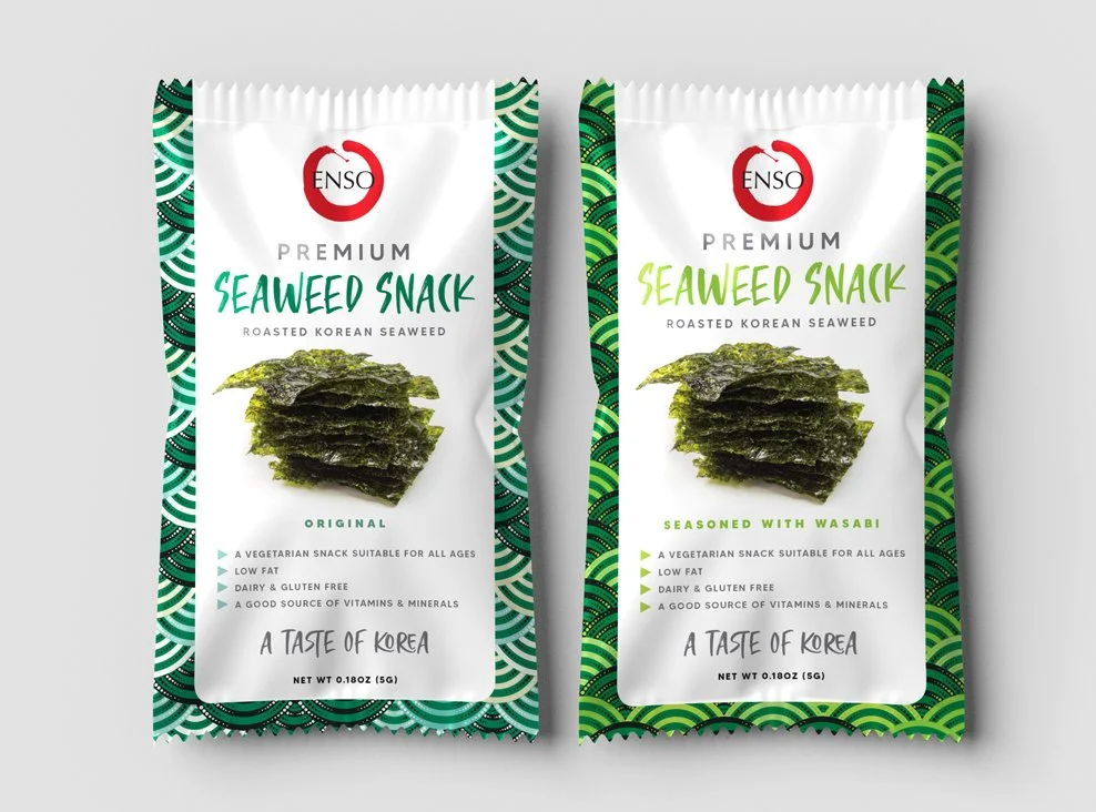
So what decisions are customers making about your product in those 3 seconds?
Whether it’s worth the price you’re asking (perceived value)
Does it appeal to them and invoke a connection through the use of imagery, colours or fonts
Is it trendy and a bit of a social status product? Some people love to keep up with the Jones’
Is the packaging sustainable? If this matters to your intended customer then this matters!
Packaging Size is there value for money here?
Can I see the product inside the packaging?
All these questions and more are assumptions made based on your packaging design alone
They hold a huge amount of influence over whether someone decides to purchase your product or not. You know it’s true, because we all do it.
72% of Americans are influenced by packaging design in their purchasing decisions. 55% have been swayed by ‘unboxing’ videos that lead them to purchase a product (still think those things don’t matter?) They shouldn’t, but the human brain is a wicked, wicked thing, and unfortunately these relatively silly things do make a difference whether we like it or not.
Knowing all these constant decisions consumers are weighing up, helps us make better decisions around the design to reel in your intended audience.
Take a minute to evaluate your packaging design now and ask someone who may never have seen it before what their first impression was around all the things mentioned above.
Ensure it aligns with what you intended otherwise it could be time to make some adjustments. If you need some guidance feel free to reach out, it’s what I do.